Today (15/5) was a bit of a disaster. I had my day scheduled out. And gave myself double the amount of time I needed for setting up the exhibition, and timetabled the rest of the day around that.
However, there were some complications with my space that were entirely out of my control and I got almost nothing done that I needed to.
For this reason, my key stage 3 presentation's character has less animation than I would like. I'm not happy with the amount of work I produced today, and it's a shame that factors out of the class' control had to get in the way...
Wednesday, 15 May 2019
Digi-Lessons
Tonight I finally finished filming and editing my digi-lessons. I'm so so happy with how they turned out. To me, these were one of the most crucial parts of my project, especially as I haven't been able to present my work to an actual school. I based my video style on a cross between a TED Talk, and a casual vlog. You can see all three videos below...
Whilst I am really happy with how my digi-lessons worked out, and they definitely succeed my expectations of my own work, there were a few issues. Firstly, my microphone didn't work for KS2 video, which means the sound is slightly to the other two video. What's worse is that this also happened towards the end of the KS4 video, so there is a point at which the sound quality just gets slightly worse.
Another issue I had was that my camera overheated and cut out a few times. When it did, it erased some footage, and I didn't notice. This meant there was about 30secs of information missing from the KS3 video. However, I decided not to reshoot, as it would be difficult to replicate the same shoot, and that would ruin the continuity of the video.
Other than this, I do think I need to work on my delivery a lot. I feel like I haven't 100% found my presenting style and it really shows, as I'm very inconsistent in my tone.
But still, overall, these were a fab success!
Tuesday, 14 May 2019
Useful Links
Last semester, I used a blog post to collect and casually reference sites and sources that helped throughout the development of my project. I hadn't intended to do this again this semester, as I didn't think this project would require as much research. However, a few weeks in, I am realising how much research I am finding myself doing. This list will be re-dated every time it is edited, so as to keep it at the top of the blog.
Below is a list of sources that have informed the progress of my project:-
- Social Media Kids Are Using; www.commonsensemedia.org/blog/16-apps-and-websites-kids-are-heading-to-after-facebook
- Ofcom Kids on Social Media Stats; www.bbc.co.uk/news/technology-42153694
- How Are Children Using Social Media; www.cobis.org.uk/blog/how-are-your-children-using-social-media-the-facts
- Social Media Explained; youtu.be/SgNIIUD_oQg
- Do's and Don'ts of Social Media; youtu.be/hqezbib5qpQ
- Social Media Rules for Kids; youtu.be/w9vF_b4F2wI
- Social Media Addiction; youtu.be/VJcxbOmV6Do
- Kids and Social Media; youtu.be/RAFSrGX0mxk
- Social Media Safety; youtu.be/TZP9A5tl1lw
- The Dangers of Social Media; youtu.be/6jMhMVEjEQg
- Popular Kids' TV Shows; www.ranker.com/list/best-current-cartoon-network-shows/ranker-tv
- Best Animated Series of 2018; filmschoolrejects.com/best-animated-series-2018/
- Top 10 Cartoons of 2018; www.thetoptens.com/cartoons-2018/
- Stegosaurus Wood Cut Out; www.amazon.com/Stegosaurus-Dinosaur-Unfinished-Variety-Nursery/dp/B014E9XEAK
- Dinosaur Art; http://thecontentcompany.co/wp-content/uploads/2018/08/dinosaurs-coloring-pages-simple-page-dinosaur-cartoon-the-good-pictures-pa.jpg
- Dinosaur Outlines; http://vocal-r.com/wp-content/uploads/2018/10/simple-dinosaur-drawing-easy-dinosaur-drawing-at-getdrawings-free-for-personal-use-ravens-coloring-pages.jpg
- Dinosaur Temp Tattoos;
https://ae01.alicdn.com/kf/HTB1AY1eaWzB9uJjSZFMq6xq4XXaW/Water-Transfer-Tattoo-cute-cartoon-dinosaur-egg-cat-bird-tattoo-Waterproof-Temporary-fake-Tattoo-for.jpg
- Pixel Dinos;
https://i.etsystatic.com/18401359/r/il/2c3ac2/1692606037/il_570xN.1692606037_8vn3.jpg
- Dino Phone Stand; www.amazon.com/Plinrise-Phone-Dinosaur-Silicone-Creative/dp/B06XXPZR2M?ref_=fsclp_pl_dp_3
- Dinosaur Silhouettes; https://fscomps.fotosearch.com/compc/CSP/CSP709/dinosaur-types-signed-name-icons-set-stock-illustration__k54178677.jpg
- Requirements for DBS Check; https://www.crb-check.com/types-of-crb-checks/required-documents-for-a-crb-check
- DBS Checks Explained; https://www.ucheck.co.uk/dbs-checks-in-education-ofsted-requirements/
- DBS Checks and School Trips; https://www.ucheck.co.uk/dbs-checks-and-school-trips/
- DBS Check Guide; https://www.qaeducation.co.uk/content/guide-dbs-checks-education-sector
- Working Without DBS; https://crbdirect.org.uk/starting-work-without-a-dbs-check/
- Ofsted and DBS; https://www.safeguardinginschools.co.uk/ofsted-say-disclosure-barring-dbs-checks/
- Enabling Custom Thumbnails on YouTube; https://www.youtube.com/watch?v=xzna4puSuwE
- Bullying Stats; http://www.bullyingstatistics.org/content/cyber-bullying-statistics.html
- Why Isn't Bullying Reported; http://yth.org/teens-dont-report-cyberbullying/
- Bullying Victims; https://www.verywellfamily.com/reasons-why-victims-of-bullying-do-not-tell-460784
- Social Media Stats; https://www.thebalancecareers.com/what-to-expect-in-your-social-media-manager-career-2315328
Creating My Website
Surprisingly, one of the parts of my project that took the longest and that I'm most satisfied with is actually my website. I am so so satisfied with how my website worked out! Below you can see a video walk through of the site, but you can access the site itself at...
https://maxiegeemail.wixsite.com/socialmedia
https://maxiegeemail.wixsite.com/socialmedia
In this post I will very briefly run through my choices on each page...
Home.
The home page was the first page I designed, and was how I decided on my house style for - not only my website - but also my logo, which I was designing at the same time. I wanted the home page to be strong, stark and minimal. So I went for a slogan and a blurb in the central space, and below, a list of relevant facts that fade in as you scroll down. Considering this was the first page I completed, I am still so happy with it.
About Us.
The About Us page carries a theme that almost all the other pages also do - a big, bold greeting as the title with a teeny tiny thin underline. This was something I came up with when resizing my text and was a total accident but I am so happy with it.
The About page also really showcases the tone of voice I decided to go with on my site. My site is very silly and casual and I hope it can help engage my audience by not making the subject matter too serious.
The choice of photos here was also a coincidence. I was playing around with my camera, viewing files, and I really liked how the portraits looked stacked up.
Digi-Lessons.
The main Digi-Lessons page is one that I hadn't planned to spend too long on, as it wouldn't be used too much (I have a dropdown menu). I just threw on my video thumbnails and put text over the top, then added a hover animation.
Key Stage [x].
The actual digi-lesson pages are exactly how I always had in my head - sticking to the theme, short and too the point, and with a fact file so the viewer can just skim.
Resources.
The Resources page was really fun to do, as I got to use a slider for the first time! However, it did take me a lot time to get the positioning of it right, as I kept dropping it onto the footer...
Contact Us.
The design for my Contact page changed slightly after consulting with Gareth. I had originally planned to have a submission form on an otherwise blank page, but when having a totally unrelated conversation with Gareth, he mentioned that these forms sometime just... don't work? Because of this, I added lots of clear text to point to my email address to give my audience that option.
What Happened to My Print Products?
Recently, I had a meeting with Claire and we discussed my choice to produce print products. I explained that I wasn't really feeling the purpose behind them, and felt like I was just giving myself extra work that would detract from the quality of my main pieces. Claire agreed that I could just give teachers a copy of the slideshow, instead of giving them one flimsy printed version that could get damaged and wouldn't be so easily shared.
However, there were elements of my print work that I want to maintain. One of those elements was the choice to have guides available for the students in case they're struggling to set their profiles on private (as I state this as really important, but different apps can make it very difficult).
Below, you can see these guides, as well as the like to where they're stored on my website...
https://maxiegeemail.wixsite.com/socialmedia/materials


Exhibition Details
For information on my presentation choices for my exhibition space in the degree show, please check this link to a post centred on my design decisions...
https://degreeshowdiary.blogspot.com/2019/05/central-designbuild-tracking-post.html
https://degreeshowdiary.blogspot.com/2019/05/central-designbuild-tracking-post.html
Sunday, 12 May 2019
YouTube Channel
As I needed somewhere to host my videos, I thought I'd make a full YouTube channel for my brand, instead of just hosting them on mine. I think this looks really professional, and I'm really glad I made that little choice...

Something that came with the YouTube channel was the fact I had to take my videos' presentation a lot more seriously. This meant working to use the right tags (incl. trigger warnings), but also creating custom thumbnails. This was something I hadn't done before and took some research to figure out (see; Useful Links). Below you can see the original photos, and the thumbnails I turned them into...


Link to channel: https://www.youtube.com/channel/UCBFKetzhNtOUDbf7-dK7wgA
Something that came with the YouTube channel was the fact I had to take my videos' presentation a lot more seriously. This meant working to use the right tags (incl. trigger warnings), but also creating custom thumbnails. This was something I hadn't done before and took some research to figure out (see; Useful Links). Below you can see the original photos, and the thumbnails I turned them into...


Saturday, 4 May 2019
Are My Dinosaurs Appropriate? + Feedback From Second Industry Panel
Generally, my second presentation to the industry panel went a lot better than the first. They were all very happy to see I had stuff to show as far as design ideas go. You can see the presentation that I showed to them, below. Unfortunately, Slideshare butchered my font choice, but it just about shows my initial ideas for my design styles for each presentation...
As you can see, in this presentation, I have my original dinosaur designs. All three of the industry panel experts were unsure of the designs, Jason and Kevin suggested they were too young for my target audience, whilst Becci mentioned that they were a bit flat and lifeless. I definitely agree with these critiques now, looking back on these designs. I redesigned the dinosaurs into what you see below to give them more life and personality (I had to include the gifs instead of the original png files due to technical issues)...


As you can see, in this presentation, I have my original dinosaur designs. All three of the industry panel experts were unsure of the designs, Jason and Kevin suggested they were too young for my target audience, whilst Becci mentioned that they were a bit flat and lifeless. I definitely agree with these critiques now, looking back on these designs. I redesigned the dinosaurs into what you see below to give them more life and personality (I had to include the gifs instead of the original png files due to technical issues)...


Still, after my redesigns I remained nervous about the possibility that I was patronising my audience with the simplistic, brightly coloured designs. The best way I could find to check this, was to dive straight in with market research. Unfortunately, I don't know many 7-11 year olds, so I had to count on my Facebook friends!

Below is the message I sent to those who commented on my status...

Here are some of the responses I received...


I'm really happy with the feedback that I received. I know, as I was the one asking, there may be a 'demand characteristics' situation where they say there are no issues so as to spare my feelings. But, still, I'm so happy that I didn't receive any negative feedback. But what was an even better result for me was this interaction I had with a mother who's opinion I sought out...


This response made me really happy, as I want my presentations to be accessible to all students, especially as those with impairments or difficulties are usually more at risk online than most.
Wednesday, 1 May 2019
Deciding on the Content of the KS4 Presentation
My initial plan for my key stage 4 presentation was to have it with only text and design elements. I felt adding illustrations would be a bit patronising, and I didn't want to risk that (especially after I'd been picked up for it so much in my industry panel presentations). However, I started getting back into photography in the recent months, and wondered if I could incorporate a level of photography into the presentation. I even went so far to organise a shoot, you can see some images from this shoot below. These are all pre-editing, so would be a lot cleaner if I actually decided to use them in my work...


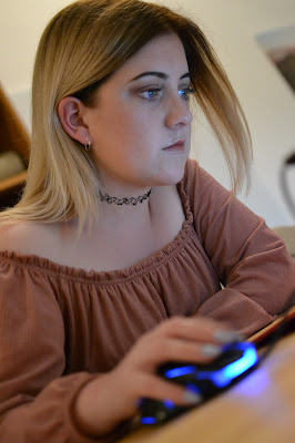


As well as this shoot, I also had photos from my coverage of the Esports Events Society's gaming tournaments, that I intended to use, as they fit with the 'work with computers/social media' theme. Click the link here to check out some of those images...
However, when I actually sat down and tried to fit the images into my presentations, they just looked so bulky and out of place. Because of this, I have decided to go back to my original plan of having a design-based presentation, instead of trying to force images into my slides that just don't work. Still, I'm glad that I tried it out. Luckily, the design style I had down was already pretty interesting, so should look suitable and professional on it's own.
Sunday, 28 April 2019
Key Stage 2 Final Presentation
Below, you can see the final presentation I've produced for the Key Stage 2 group. This presentation is themed around safety online
Wednesday, 24 April 2019
Upload Tests
Due to the way I'm presenting my work, I had to find a way to share my presentations online. Regularly, I would use SlideShare for this purpose, but when I attempted that with my finalized Key Stage 3 presentations, I found that the fonts I used were not supported...
I tested a couple of options (which can be seen below) to get both the fonts and animations working when the presentation is shared online. I did some research on exporting fonts with presentations and managed to make it work in a way, but for some reason in only worked with my title font and not my bulk text. As I put a lot of effort into deciding on the font, I didn't want to alter it just due to technical difficulties. So I converted the text into a shape on each slide, so I could keep the font. You can see the progress of this in my tests below.
The Choice to Animate
From the conception of my project I made the decision to include some small animations on my powerpoints. This was to ensure that I kept the attention of my audience without distracting too much from the content. The most important animations that i intend to create are on the presentation for Key Stage 2, on my dinosaur characters. I think this will add a real sense of fun that is required when talking to younger children. For most of the dinosaur characters, the animatinos I chose are fairly obvious. These choices were inlfuenced by my industry panel's suggestion that I have my charcters interacting more with the content on my slides. However, I did struggle with deciding on an animation for the introductory slide with the red Triceratops. As the slide involved a lot of questions, I wanted to have an aspect of confusion or curiosity about the animation for the character. I decided to produce 3 mockups of different animations to decide which looked best in practise. At this point I was also around a family member who works with children and asked for advice to get feedback on what would be more effective considering the young audience. You can see the 3 animation options I created below.


As for the animations for the Key Stage 3 presentaion, I decided to go for an even more simplistic animation, as this age group are more able to concentrate on presentations, and more likely to be interested by and interact with the content without requiring an attention grabbing tool. Instead, my plan for the robot character animations is to include a "Telly Tubby" style screen on his chest. Here, I plan to have an image that flickers onto the screen which will change for each new slide. I also may decide to add a small amount of screen flickering and pixelation to keep a level of personality and intrigue.
For the same reason I chose more simplistic animations for the Key Stage 3, I decided to not include animations at all for the Key Stage 4 presentation as, drawing from my own memories of that age, I believe the 15/16 year old students would be put off and feel patronised by the inclusion of animated characters.
Tuesday, 23 April 2019
Logo Creation
For this project I decided that I needed a clean and modern logo to make my brand more identifiable. I knew that I wanted to integrate the speech bubble concept as I believe this connotes the "social" aspect of social media. I also wanted the logo to be angular so it appeared a bit more edgy and unique. At first I played with the idea of using a question mark and exclamation mark because I was yet to settle on a title for the project and you can see examples of this below. During the experimentation with these designs I tested different sizes of speech bubble and text, and different fonts. All fonts used were royalty free entirely, meaning I am able to use designs incorporating these fonts for personal and commercial work.


Soon after starting the logo design, I came up with the title "SOCIAL [ME]DIA". Something I really liked about this idea is the use of the square brackets, which I think really lends itself to the design. Because of this, I decided to try using the ME part instead of the punctuation marks. Also, I realised that the punctuation marks implied the use of bad language, which obviously would not be suitable for working with children. From here I used what I have learned about speech bubble sizing from the initial idea to inform my choices. You can see this in the development images below.


Whilst designing this logo, I decided to play with the opacity of the brackets as I felt they were too strong as they were originally, and I wanted to give the logo more depth. I think this is actually a really clever and effective element of my design work. As you can see in the process images I still had to make changes regarding the sizing of the font and the speech bubble. As a base logo I was happy weith this preliminary design, however I wanted to test different colour and background options to make it adhere to the style of the other elements of my work. You can see examples of this below.


As you can see I recoloured the logo to fit with the colour scheme of each of the presentation packages. At this point I inserted them into the in-progress presentations to ensure they were effective in practise. From here, I decided that I wanted to build a background in order to keep the logo more interesting when used independently. I chose to keep the colour scheme blue as this was a fairly neutral colour that hasn't been assigned to a year group in my work. I also took a simple photo of a keyboard and manipulated the colours so the background was more exciting. Overall I am very excited about how my logo ended up, it is currently one of my favourite designs that I have produced for this project.I am also very happy with the unusual shape and how interesting it is when fitted in to larger pieces, however when I later came to use the logo in practise I realised the colours were slightly wrong to what I intended, so I used layer masks to achieve the desired effect.

Subscribe to:
Posts (Atom)