Below, you can see the final presentation I've produced for the Key Stage 2 group. This presentation is themed around safety online
Sunday, 28 April 2019
Key Stage 2 Final Presentation
Below, you can see the final presentation I've produced for the Key Stage 2 group. This presentation is themed around safety online
Wednesday, 24 April 2019
Upload Tests
Due to the way I'm presenting my work, I had to find a way to share my presentations online. Regularly, I would use SlideShare for this purpose, but when I attempted that with my finalized Key Stage 3 presentations, I found that the fonts I used were not supported...
I tested a couple of options (which can be seen below) to get both the fonts and animations working when the presentation is shared online. I did some research on exporting fonts with presentations and managed to make it work in a way, but for some reason in only worked with my title font and not my bulk text. As I put a lot of effort into deciding on the font, I didn't want to alter it just due to technical difficulties. So I converted the text into a shape on each slide, so I could keep the font. You can see the progress of this in my tests below.
The Choice to Animate
From the conception of my project I made the decision to include some small animations on my powerpoints. This was to ensure that I kept the attention of my audience without distracting too much from the content. The most important animations that i intend to create are on the presentation for Key Stage 2, on my dinosaur characters. I think this will add a real sense of fun that is required when talking to younger children. For most of the dinosaur characters, the animatinos I chose are fairly obvious. These choices were inlfuenced by my industry panel's suggestion that I have my charcters interacting more with the content on my slides. However, I did struggle with deciding on an animation for the introductory slide with the red Triceratops. As the slide involved a lot of questions, I wanted to have an aspect of confusion or curiosity about the animation for the character. I decided to produce 3 mockups of different animations to decide which looked best in practise. At this point I was also around a family member who works with children and asked for advice to get feedback on what would be more effective considering the young audience. You can see the 3 animation options I created below.


As for the animations for the Key Stage 3 presentaion, I decided to go for an even more simplistic animation, as this age group are more able to concentrate on presentations, and more likely to be interested by and interact with the content without requiring an attention grabbing tool. Instead, my plan for the robot character animations is to include a "Telly Tubby" style screen on his chest. Here, I plan to have an image that flickers onto the screen which will change for each new slide. I also may decide to add a small amount of screen flickering and pixelation to keep a level of personality and intrigue.
For the same reason I chose more simplistic animations for the Key Stage 3, I decided to not include animations at all for the Key Stage 4 presentation as, drawing from my own memories of that age, I believe the 15/16 year old students would be put off and feel patronised by the inclusion of animated characters.
Tuesday, 23 April 2019
Logo Creation
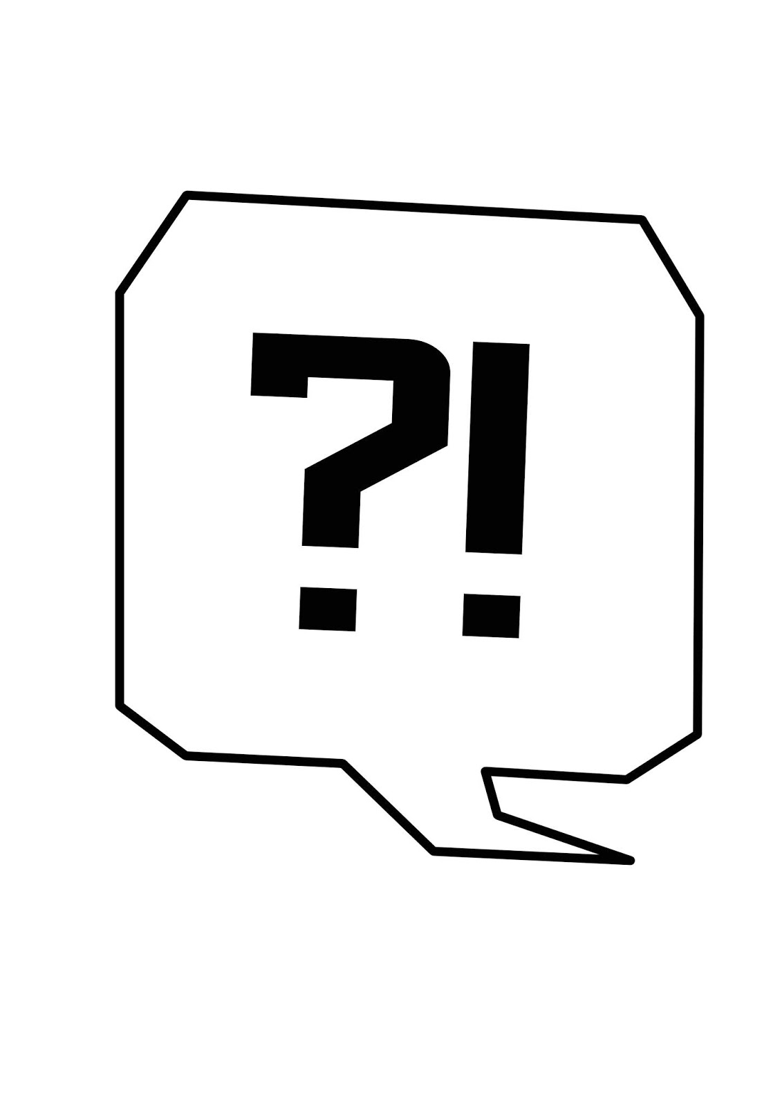
For this project I decided that I needed a clean and modern logo to make my brand more identifiable. I knew that I wanted to integrate the speech bubble concept as I believe this connotes the "social" aspect of social media. I also wanted the logo to be angular so it appeared a bit more edgy and unique. At first I played with the idea of using a question mark and exclamation mark because I was yet to settle on a title for the project and you can see examples of this below. During the experimentation with these designs I tested different sizes of speech bubble and text, and different fonts. All fonts used were royalty free entirely, meaning I am able to use designs incorporating these fonts for personal and commercial work.


Soon after starting the logo design, I came up with the title "SOCIAL [ME]DIA". Something I really liked about this idea is the use of the square brackets, which I think really lends itself to the design. Because of this, I decided to try using the ME part instead of the punctuation marks. Also, I realised that the punctuation marks implied the use of bad language, which obviously would not be suitable for working with children. From here I used what I have learned about speech bubble sizing from the initial idea to inform my choices. You can see this in the development images below.


Whilst designing this logo, I decided to play with the opacity of the brackets as I felt they were too strong as they were originally, and I wanted to give the logo more depth. I think this is actually a really clever and effective element of my design work. As you can see in the process images I still had to make changes regarding the sizing of the font and the speech bubble. As a base logo I was happy weith this preliminary design, however I wanted to test different colour and background options to make it adhere to the style of the other elements of my work. You can see examples of this below.


As you can see I recoloured the logo to fit with the colour scheme of each of the presentation packages. At this point I inserted them into the in-progress presentations to ensure they were effective in practise. From here, I decided that I wanted to build a background in order to keep the logo more interesting when used independently. I chose to keep the colour scheme blue as this was a fairly neutral colour that hasn't been assigned to a year group in my work. I also took a simple photo of a keyboard and manipulated the colours so the background was more exciting. Overall I am very excited about how my logo ended up, it is currently one of my favourite designs that I have produced for this project.I am also very happy with the unusual shape and how interesting it is when fitted in to larger pieces, however when I later came to use the logo in practise I realised the colours were slightly wrong to what I intended, so I used layer masks to achieve the desired effect.

Saturday, 20 April 2019
Choosing What Software to Animate With
Although my animations are only tiny and simple, I really didn't want to cut corners, so I tested out a few animation programmes before deciding on which one was the most suitable for what I wanted. Below are my notes from my experience...
MotionArt-
Pros:
- Experience with it (1st year motion comic).
- Good for very simple movements.
- Clear and easy to use.
Cons:
- Is definitely tailored towards motion comics and not single icons.
- Can be restrictive.
- Difficult to access (my copy keeps crashing and freaking out).
Animate-
Pros:
- Fairly easy to use.
- Not restrictive.
- Very easy to transfer results to other Adobe products (I create the art in photoshop and will be using it in Premier Pro).
Cons:
- I grew up using Flash, which turned into Animate, so I keep trying to use old controls and confusing myself.
- Can take a long time.
- My tablet struggles to run it.
Premier Pro-
Pros:
- Very familiar with it.
- Know how to use it very quickly.
Cons:
- Not actually an animation software.
- Awkward and longwinded.
- No preview option.
- Hard to do small pieces.
Photoshop-
Pros:
- Very familiar with it.
- Quick.
- Can produce animated gifs of any shape.
Cons:
- Can reduce quality.
- Not actual animation software.
I decided to go for Photoshop in the end, as it was the technique I liked to used in my spare time. I know I can use it well, and I'm confident in the results it produces.

Subscribe to:
Posts (Atom)